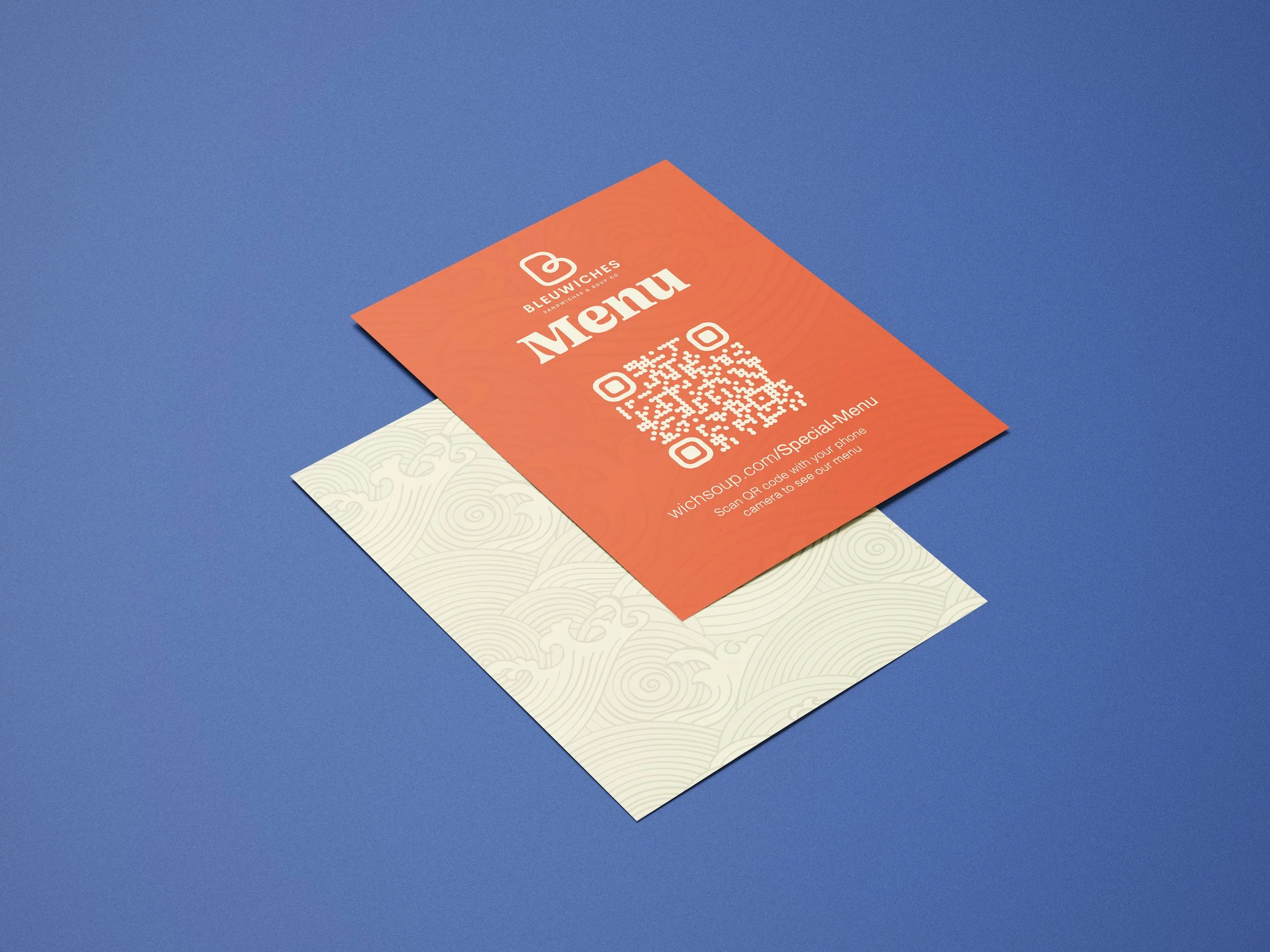
Bleuwiches Pattern Design
Branding Colors and Patterns
For Bleuwiches, we crafted a unique branding identity that reflects the essence of both the owner's South Korean heritage and Seattle's maritime culture. Our design integrates an Asian-style sea wave pattern, symbolizing the fusion of Korean flavors with Seattle's coastal spirit.
Printed Menu Design
The printed menu features a striking combination of blue, red, and yellow, representing the sea, meat, and bread respectively. This color palette not only aligns with the sandwich shop's theme but also ensures readability and appeal. The intricate wave patterns add a touch of elegance and cultural relevance, enhancing the overall customer experience.
Digital Menu and QR Code Integration
In today's digital age, having a dynamic and accessible menu is crucial. We designed a digital menu that is not only visually appealing but also easy to navigate. The integration of a QR code allows customers to access the menu effortlessly using their smartphones, ensuring a seamless dining experience.
Website Design
We created a responsive and user-friendly website for Bleuwiches that complements the printed and digital menus. The website features the same color scheme and wave patterns, ensuring brand consistency across all platforms. Our design focuses on enhancing user experience with easy navigation, clear menu display, and online ordering capabilities.
Bringing It All Together
Our holistic approach to Bleuwiches' branding and design ensures that every touchpoint, from printed menus to the website, reflects the shop's unique identity. This cohesive branding not only attracts customers but also builds a memorable and engaging dining experience.

